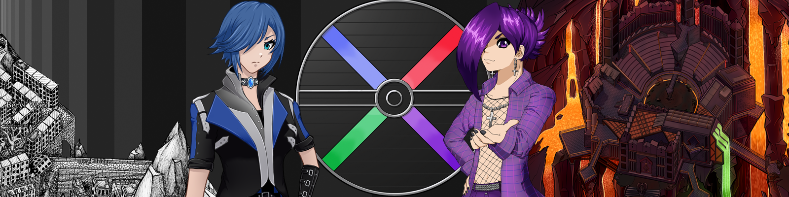
Amethyst
-
Posts
11236 -
Joined
-
Last visited
-
Days Won
582
Content Type
Profiles
Forums
Events
Reborn Development Blog
Rejuvenation Development Blog
Desolation Dev Blog
Everything posted by Amethyst
-
There'll have to be a way to get more in the future since the other one has to be gotten. For now, sorry. And it's because I had junk code on that page from when I was adding 6th gen fossils; forgot to delete it
-
That's not too bad... I think it just needs a bit of cleaning up. Specifically, the outlines around the feet, both facings, and then the pixelation shading around the tail as a whole on the back sprite and very tip of the tail on the front. Poliwags look great; I'll put those in once we have matching evos Muk looks good; I'll put that in. With Sandshrew, can we get more contrast in the shades of blue? As it is we're losing the definition of its scales. Sandslash... is a bit better, but are those colour shades on the same actual colour? Could we make the 'spikes' a bit darker than the rest of its body? I know that's not a sonic thing but it'd look a bit truer to Sandslash. With Ponyta, go with whatever the original sprite is. I'm not sure how I feel about Kabuto's eyes. Try using a darker colour on their outline so they blend in? If that looks weird, then at least make them match that red. I personally like the red one a bit more but either is good. How about others? Machop looks pretty wicked, I'm not gonna lie. However, I'm a bit hesitant to go on dramatically changing the shape of something for what's officially just supposed to be some colouration differences. Now granted, we are taking some creative liberties here, but... I dunno, what do others think? Do you think it would be jarring for a shiny Pokemon to have its head like that even if it is for a shiny theme? I like this Machamp colouration better so I have it quoted here. However, I think the shades could contrast just a bit more, (towards darker). Also, it's done pretty well on Machop but there are some places where its wounds could be blended in better using darker shades.
-
Actually we figured it out and fixed it. I'm dumb. Just don't talk to the guy again before leaving/re-entering the building (through the main entrance)
-
Every episode is always going to feel short, because Episode 11 is 1/11th of the story, 12 will be 1/12th, 13 will be 1/13th and so on. So just be ready for that.
-
Considering Essentials doesn't have 6G in yet, it's Reborn. Already fixed for 12 though
-
I could see how that would be an issue. Feel free to tweak it or use blending colours. Play around with it~ Right. I like the concept with Scyther, but aside from needing a back sprite I probably wouldn't include this sprite in the game as is. It shares some key issues with that dragonite recolour in that, firstly, we're losing the contrast of the shades so the image appears flat, and secondly, some of the outline pixels don't pop enough which makes it appear less crisp.
-
For a while, we took in a homeless boy who was just a little older than me and interested in games and such too. Somewhere in between his playing Reborn and getting inexplicably frustrated with it (he seemed to keep this habit with any video game), a ton of different alternate titles for him were thrown out and we decided that that one was too douchey to possibly pass up. Victoria should always be Apprentice since around that time too, so I'm not sure what's up with that.
-
Online pickup table has been updated pre-emptively for E12 changes. Don't let it trick you in the meantime.
-
No, you're doing great. I was actually hoping you'd pick up some of these because you do well with them Ruby of the Sea is a reference to the anime-- Misty says that Tentacool are called that in one of the early episodes of the anime so I wanted to embody that. The other Tenta family you did wasn't bad, and it did help me to realise that it was probably the body that needed to be the vivid colour. This take is pretty good. With Poli- family I think my notes were a little unclear, so sorry about that. In writing, "blue > whatever" I meant like, change the the blue to the Azurine colour-- that tawny brown pollution lake colour, so it's like the water type has absorbed the region's pollution. Thinking about it, maybe bonus points if this is made more clear by that colour (or maybe even the rancid wine colour from the factory) being imprinted as splotches across Poliwrath, like the pollution shows up as murk-coloured hives or something on its body. That might be pretty difficult though. Unless it's something pretty obvious (like Hippowdon) I'm not concerned about gender differences. I'll take whichever looks cooler. Marked all those except Polis off the list.
-
Uh... No, not so much. Not in the code anyway. The only Pokemon he has that knows Focus Blast is Reniclus. Are you sure you didn't get the glitch where fainting a Pokemon mid-turn causes the next sent-out Pokemon to use the fainted one's move?
-
The tears of my enemies.
-
So whereas the other topic is for coming up with ideas on which shiny changes to make, this is for actually implementing them. And fair warning, this is where I am going to get really picky. Keep in mind we need both front and back sprites for everything. Back sprites should be Gen V style-- Feel free to take the files from the Game Folder/Graphics/Battlers to edit but when you do be sure you grab the non-shiny backsprite for editing since the existing shiny back files are Gen IV style I'll keep the list below updated of what's been done and what hasn't. Also, these ideas are not immutable. If you have a better idea, feel free to make that one too- but again, no promises that it'll get used. Have at it!
-
WHAT LOL I CANT BREATHE
-
Doing eyeliner normally is boring. I really like doing cracked-eye eyeliner so I thought I'd take a picture of it. Only as it turns out my camera quality is terrible so you can barely even see. Oh well. Then I got bored and took a picture more appropriate to what some people have come to expect from me.
- 4053 replies
-
- 10
-

-
Do I have to? Fine. This is old content, but evidence of the fact that not everything on that little changelist was entirely false...
-
They aren't remixes. They're the exact same sound file pitch/tempo adjust by the program. To use a visual analogy, it's like looking at a painting, and then looking at the same painting with sunglasses on. There isn't a 'darker' version of the painting that exists anywhere- it's just how it's seen.
-
I don't either, although of his skins, I'm glad that Kingpin happens to be the one I have. I'm hoping that his dialogue comes across sufficiently "manic"
-
That's correct, but like the other request, it's also pitch/tempo adjusted for that place.
-
Grimolt was a wolf-like Ghost/Fire type (this was in Gen IV before Chandelure existed) I also made sprites for it, but apparently the linked images in the CAP thread are dead now. Maybe another user has it saved.
-
Incidentally, what they were talking about in the beginning of the URF video is something I've been thinking about a lot lately. Riot must have been dealing with the same problem and they did this as a satire. In that sense, I really appreciate it. I don't think they were expecting it to go over quite this well though...
-
Surprise! Thanks to everyone's help and the naturally shorter episode content, we were able to get the newest episode finished out and shipped almost immediately! I opted to skip the standard ace/beta time because that has been increasingly disorganized and severely slows down the release times, however I've had several alpha testers play the new content under my personal supervision so it should be stable. Download link is below the changelist. Enjoy~ Click here to download!
-
It's part of the game engine itself
-
Just unzip the downloaded file and run Game.exe like you did the first time. Your old game folder can be deleted.
-
Clarification from earlier status: Sex = between your legs; Gender = between your ears.
-
Item generator is still broken, and as it turns out it may be because of the recent 500 errors, or related So I haven't been able to resolve this yet... Sorry.