-
Posts
188 -
Joined
-
Last visited
-
Days Won
1
Content Type
Profiles
Forums
Events
Reborn Development Blog
Rejuvenation Development Blog
Desolation Dev Blog
Everything posted by Felcatty
-
@Amine elhedhili The backsprites look nice, although there's still some purple outline on both (be careful of that outline) and also Liepard's mouth seems to be missing.
- 349 replies
-
- pokemon
- rejuvenation
-
(and 2 more)
Tagged with:
-
Ok, cool. Well that answers my question. Thanks Atticus.
- 349 replies
-
- pokemon
- rejuvenation
-
(and 2 more)
Tagged with:
-
Hey Jan, correct me if I'm wrong but isn't there already a custom shiny garbodor in the game; the purple one that Melia 'made'? Sorry I've just been a bit curious for a while, especially since it doesn't resemble the original or Reborn's. I have no ideas for a shiny version, just curious is all. I feel like the same also applies to Vivillon as well. Sorry if the question was already answered.
- 349 replies
-
- pokemon
- rejuvenation
-
(and 2 more)
Tagged with:
-
@Korvpizza umm...there appears to be a bit of red outline on crustle's backsprite that goes through the blue, perhaps change to a dark blue or black cause it looks a little strange to me
- 349 replies
-
- pokemon
- rejuvenation
-
(and 2 more)
Tagged with:
-
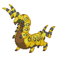
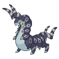
@DreamblitzX Same here, third and fourth are my favs. I love the green and black combos though they work really well together. Scolipede is not a pokemon I use that often, so I think I might have been in over my head trying to choose shiny colours but here's what I whipped up: I kinda just have this habit of doing the whole line to see how it goes I was not bothered to do the whole line with this one though... Just putting it out there, I don't like whirlipede's colour scheme...I don't know why...I just don't To me the colours don't fit, it might just be me but....oh well Edit: I've read Might Gai's comment below, if whoever's doing alomamola wants to do it like luvdisc here are the sprites to save you time looking:
- 349 replies
-
- pokemon
- rejuvenation
-
(and 2 more)
Tagged with:
-
Is it alright if I have a go at Venepede?
- 349 replies
-
- pokemon
- rejuvenation
-
(and 2 more)
Tagged with:
-
@Amine elhedhili That blue is definitely more easy on the eyes, you can even make it a little darker if you want to show off those dark colours, I think the main aspect now is shading. I find blue a tricky colour to work with regarding shading since you don't want it too dark that the shading becomes black, however there are areas where you shading could be darker so that it becomes more noticeable. There's also still shading loss on it's rear right leg but you're definitely getting there, keep it up Also I don't have a lot to do so if anyone needs help, I can help out as well Edit: Like DreamblitzX did below, I also tested a few colours for Alomamola, here are few that could work:
- 349 replies
-
- pokemon
- rejuvenation
-
(and 2 more)
Tagged with:
-
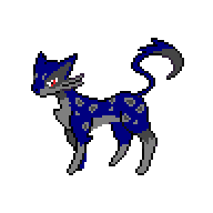
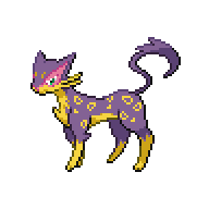
@Amine elhedhili Sorry if I'm not specific, that really is my fault. Take a look at DreamblitzX's example above your post to see if it gives you any ideas. I don't mean brighten the colours just reduce the saturation from 255 because that blue you've used, while I'm not disagreeing that it's a dark colour it just hurts the eyes a bit. So instead of having a really high saturation, head towards a more a greyish blue by gradually lowering the saturation bar (This will probably make more sense when I explain Graphics Gale below). As for shading I think the best way is to show you. Let's take your Liepard and compare it with the original sprite: If you look carefully you might be able to see some shadows (a darker colour) on the original Liepard's stomach and rear leg(s), yours has one block colour causing the sprite to appear as though there is no shadow on the pokemon. So what I'm really trying to say here is that shading = a pokemon's shadow. For the most part, without a shadow effect, the sprite could lose a lot of detail and features. I found Graphics Gale quite a fun program to mess around with. This is a video on Graphics Gale by Ame: https://www.youtube.com/watch?v=EUmeQbY7sP0 (if you don't want watch the video) all you need to do is find: All Frames (at the top) -> Color Depth... ->Dither From here you can mess with different colours and by using the HSL bar located under your colour set you can freely change colour, saturation, and brightness Here's what I see when I do these steps (HSL bar included) with your Liepard: I also right click on the image using the pen tool, that way I don't make a mistake about which colour I want to change. I'd recommend taking a bit of time just messing around with program itself, after that restart the sprite and try implementing the colours again. I know it's time consuming to restart but it's definitely worth it to take in a new perspective and start fresh as well as to make sure you didn't miss anything. See how you go I was really trying to make this not sound like a lecture, I think I failed . Hope I gave you an idea though. Does anyone else want add anything I may have missed?
- 349 replies
-
- pokemon
- rejuvenation
-
(and 2 more)
Tagged with:
-
@Amine elhedhili I think the blue is really harsh on the eyes, try lowering the saturation a bit (make it a bit duller), there's also shading loss particularly on Liepard. Just curious, what program do you use (if you've said before sorry for not noticing)? Just my opinion.
- 349 replies
-
- pokemon
- rejuvenation
-
(and 2 more)
Tagged with:
-
To be honest Jan I couldn't choose (again...), however since there are so many red sprites the last one definitely stands out to me as well.
- 349 replies
-
- pokemon
- rejuvenation
-
(and 2 more)
Tagged with:
-
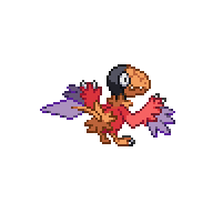
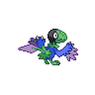
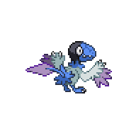
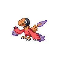
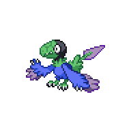
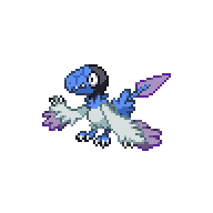
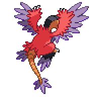
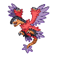
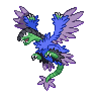
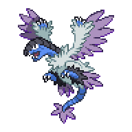
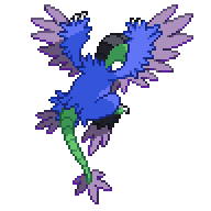
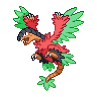
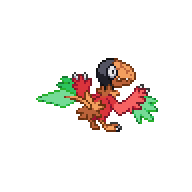
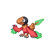
Hey Jan, just wanted to say that you skipped over Archen and Archeops (I had them in a spoiler tab; I did quite a few variants) Although to save you time finding them here they are again:
- 349 replies
-
- pokemon
- rejuvenation
-
(and 2 more)
Tagged with:
-
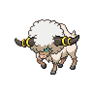
@AlexNo offence but it looks similar to reborn's shiny bouffalant @Amine elhedhili the blue is nice but the shading is hard to see, and there's also purple outline around it's eyes that could be changed to a grey or dark grey. The blue is still pretty btw Just my opinion
- 349 replies
-
- pokemon
- rejuvenation
-
(and 2 more)
Tagged with:
-
@MakaTorracat Looks nice Edit: Got called away and I forgot to say...I think the yellow shading could be a bit darker but other than that it looks nice for your first use of yellow
- 349 replies
-
- pokemon
- rejuvenation
-
(and 2 more)
Tagged with:
-
- 349 replies
-
- pokemon
- rejuvenation
-
(and 2 more)
Tagged with:
-
Thanks a lot Jan, I did some touch ups with the female but I still have @Atticus to thank for giving me such great advice and tips to work with regarding the male So once again thank you Atticus. I've also finished the Archen line and done 4 variants, I was going to post earlier but I kinda wanted to wait for Frillish to be confirmed and I didn't want to overwhelm you with sprites. Once again here we go: @Amine elhedhili No worries. About purloin though, the blue is quite bright and also clashes with the white/grey eyes, and the shading is a little hard to see. Try darkening the blue a bit or swapping the white and grey. Don't forget to keep the outline consistent as well but don't worry too much, keep practicing more and I know you will be able to do it. The sprite is pretty with with blue btw. Here's an example of what you could do using your colours: (They're not perfect either so we're both still learning )
- 349 replies
-
- pokemon
- rejuvenation
-
(and 2 more)
Tagged with:
-
@Med Amine Elhedhili Looks nice, although there are still some blue outlines on the backsprite that need to be changed to pink, however that would also be my fault for not specifying. Sorry about that. You're doing fine, keep it up Just my opinion.
- 349 replies
-
- pokemon
- rejuvenation
-
(and 2 more)
Tagged with:
-
@Med Amine Elhedhili the brightest red on Swoobat's face could have the saturation reduced more since it's really bright and makes the sprite look a little strange. There are also some outlines on the Swoobat's backsprite that are blue that need to be changed to red as well. Other than that it's not bad @Atticus Timburr's colours look fine to me, I think they work just as well. Unfortunately I don't have any ideas for Gurdurr, but it doesn't look all that bad. Just my opinion.
- 349 replies
-
- pokemon
- rejuvenation
-
(and 2 more)
Tagged with:
-
Yay managed to finish Frillish line so here we go: Male Female If these are alright I'd like to try the Archen line please.
- 349 replies
-
- pokemon
- rejuvenation
-
(and 2 more)
Tagged with:
-
- 349 replies
-
- pokemon
- rejuvenation
-
(and 2 more)
Tagged with:
-
No worries Jan. I'm a little sick at the moment so my spriting has been slowing down. I'll definitely work on these a little more later but for now a draft of what I've done so far. (Unfortunately I've only tested colour combos on Frillish) I tried to swap colour palettes (sorry I'm quite unoriginal lately, I would use purple, but I've used it so many times) Female Male (I know the shading isn't very good at the moment) Pink is the bane of my existence. Where some people have difficulty with yellow, I struggle with pinks and reds. Does anyone have any suggestions on how to use pinks effectively or any suggestions for the male frillish. Probably won't check this until a few hours later, I'll be on but I probably won't have enough motivation and energy to continue immediately.
- 349 replies
-
- pokemon
- rejuvenation
-
(and 2 more)
Tagged with:
-
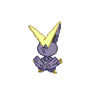
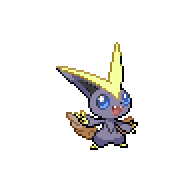
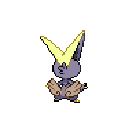
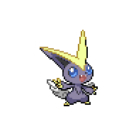
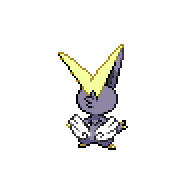
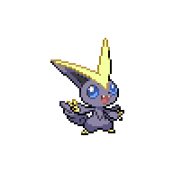
Ok here is the updated version of Victiniti: I have to ask though, why is my name next to Alomamola? I don't mind if you want me to do it since I did Luvdisc but I'm just a little confused is all.
- 349 replies
-
- pokemon
- rejuvenation
-
(and 2 more)
Tagged with:
-
I have to say that because it took me a while to do the gradient version I'm biased towards it being my fav, so opinions are more the welcome. I've finished Cottonee and Whimsicott Unfortunately I'm not very good at adding flowers, they just look like blobs and aren't natural looking on the sprite Edit# (I've lost count): if either of these are alright I'd like to try the Frillish line please, and the Elgyem line if both are alright (doubt it though).
- 349 replies
-
- pokemon
- rejuvenation
-
(and 2 more)
Tagged with:
-
I'm not really good at flowers yet but I'll give it a go Don't worry I have the same opinion about victini, so I want to change that up more
- 349 replies
-
- pokemon
- rejuvenation
-
(and 2 more)
Tagged with:
-
So here is my take on Victini (based on the rising sun, moon, and stars): I have 3 "different" cottonee ready to go: Any feedback is welcome Also feel free to criticise me for using too much black and white this gen (pun intended)
- 349 replies
-
- pokemon
- rejuvenation
-
(and 2 more)
Tagged with:
-
Can I take Victini and Cottonee lne Please Congrats @Atticus
- 349 replies
-
- pokemon
- rejuvenation
-
(and 2 more)
Tagged with:


