I guess it's been exactly a month, ain't that somethin' special?
When we last left our heroes, I mentioned that our first focus was going to be on a handful of structures that exist mainly in the backend, not necessarily things we can show off. There's A Lot To Unpack There  , but for the sake of giving a quick update we're not going to go too in-depth on any one thing. In general, we'll talk about three broad categories today:
- System overhauls
-
 ones
ones
- 1080p Resolution
look at me responsibly creating three-bullet talking points for two posts in a row like some kind of professional speaker. aren't i doing so well? it makes me sick. next post i make is going to be all one long run-on sentence and a picture of a minion if you're lucky, mark my words.
-------------------------------------------------------------------------------------------
System Overhauls
for those less familiar with software terminology, when i'm talking about the backend, i'm talking about anything in the code the player can't actually see. the opposite would be the UI and graphics-- things the player can interact with. things like optimization, update loops, loading and memory are all things that exist and relate to the backend. with that in mind, in general the project backend has been the focus over that last month.
imagine you're playing pool. billiards, that is. and you've got your cue and you're gonna be taking a shot. any good player takes a moment to line up their shot before taking it-- we wanna make sure the angle is right, that we know exactly how the 8 ball is gonna bank off the back wall, and which pocket it's gonna go into. hopefully this'll save us a turn or two down the line. that's kind of what this is. we want to make sure that all of our systems are in a good or clean place that they will be easy to work with and scale well into future development.
so, what are some backend systems we've gone over recently?
- Preloading- the demo runs two different preloading systems because one had to be added at the last minute and they kinda trip over each other. nicky has made them play nice and are easier to work with than ever!
- PIXI- pix pix pix, this is our graphics library plugin! we were previously stuck on version 4 but hewaje found a way to jump us up to version 5 which brings several years' worth of performance and stability improvements and enables us to do some cool new stuff with animations.
- Mouse Support- i wouldn't quite say we have mouse support yet, but we do now have support for mouse support. nothing to it but to do it from this point.
- Lane-handling- all of the information about showing and detecting the timed hits before was stored in a series of arrays and variables. instead, this is now a much more manageable object-oriented set up which is infinitely more stable and easier to work with. we're also setting up to do some more fun stuff with it...
- Image-managing- basically the same as the above, we're working with them a bit smarter now. still some clean up to do here. shout out to perry for doing like all three of these previous things btw.
- Message Arts- it only comes up i think once in the demo but due to a mess in how message arts are displayed, sephany actually briefly grows her wings back, and so we're having to rework this whole bit lol . . . .
- Controls- my latest project, the handling of controls was kind of a mess in the demo, and was only getting messier over time. now we have everything set up sick and span through a finite state machine so it's easier than ever to work with and refine them.
- [columbo voice] oh and uh just one more thing-- Spine.
O Great Slumbering Goddess, We Offer To You In Holy Tribute, Our Very Bones
Spine is a 2D animation software. By attaching images to 'bones' which are just a structure of data for instructions and movements, we can create 2d sprites such as the ones we use in our combat scenes in Starlight.
y'know, like this:

The Starlight demo does not use Spine. It uses a program called DragonBones. DragonBones does exactly the same thing as spine, but lags like hell, has fewer features, was effectively abandoned years ago, and (although this doesn't matter now i mention it out of sheer pain and spite) when we first started there was actually 0 english documentation for it dfjnkfdjfd
So anyway, we wanted to update to Spine. I wavered on if it would be worth it for a while-- and eventually decided that for the quality and quality of life improvements we'd be getting from it in the long term, it would. But that meant rebuilding the compatibility for handling animations, which was the biggest overhaul of them all. It was kind of a core system, and integrating third party APIs is always just suffering. software devs, you know what i mean
we won't be talking about the nitty-gritty of this overhaul or others in this post, but let's go ahead and drop a... fun screen... from when we were in the process of trying to get this to work. actually this was from during the pixi upgrade, but it's a great example of how code being a little bit off can-- um... well...
uh, here's Star:

.........and all the king's horses and all the king's men couldn't put star back together again............
but that is to say, it was a huge endeavor, and even now we're still piecing our combat models back together, but we're through the code-side part of it. another issue we ran into was that, DragonBones handles animations per-frame, but Spine handles animations per time-passed, and so we had to kind of rework the entire combat and attack-handling system around it too. fun! then again, managing per-time means that we can potentially do something like... a slow motion hit effect on kill... things like that. fun stuff. we'll get there.
other fun stuff we can do with functioning animations: not have them be in the way!
and that brings us to Jugdralian Squaredancing.
ame what the fuck are you saying?
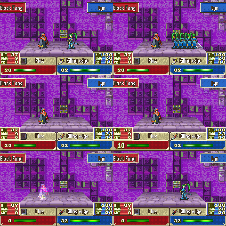
now here's where we climb out of the backend and start talking about real things that you can actually see and touch. i'm a huge FE fan, have been since i was a kid, and i saw the wild animations of the GBA FE games-- like this shit???
dope as hell. what the fuck. lyn best lord. so obviously i'm like okay let's style the game after this.
...but as we realized from the demo, that's not actually the best fit for our game compared to FE. in FE, everything is RNG-- there are no inputs in combat. they get to just show a pretty scene, but our animations have to be snappy enough to not feel like input latency, and the closer we lean towards unfortunately resembling a rhythm game, the more long animations are going to get in the way.
even ones that aren't flashy like the above--
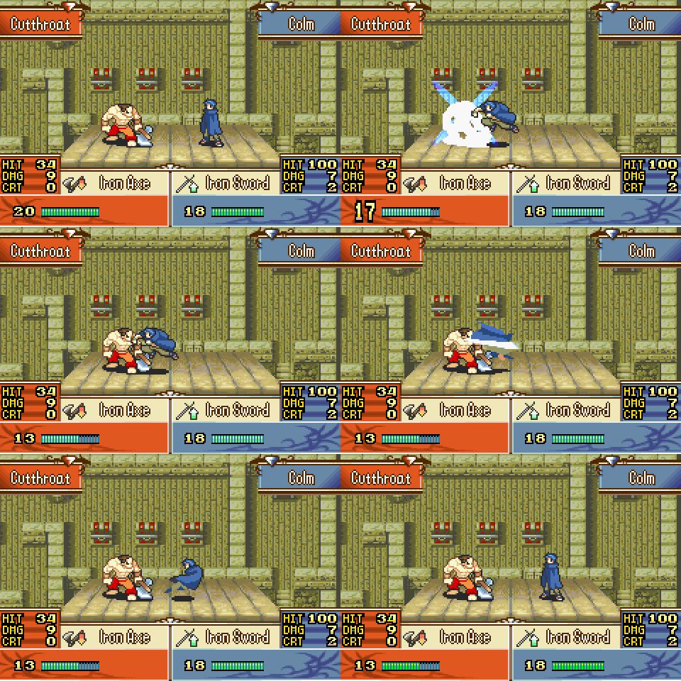
...still take a good bit of time to move forward and back. and styled after that, that was how our animations in the demo have been as well:

because we have to move forward and back between each attack like in FE games, we can only have the time hit inputs so close to each other. there were ways i tried to work around this before, and they definitely didn't not work, buuuuuuuuuuuuuuuuut....................... um anywayso last year i played FE4. It's older than the GBA titles, and after playing it i am so firmly in the camp of Echoes of Jugdral when, intsys?
but i also noticed their style of animating combat is........

...for our purposes, way better. it is just one single engage, and then simple, non-flashy attacks on the player's own time. most critically, this means we can put inputs much closer together, which greatly expands our flexibility, especially in the way of keeping the game interesting for rhythm game veterans.
so this gif is messy and the animations are WIPs, but here's an idea of what we mean at its extreme, where we can now concentrate a bunch of attacks close together if we so choose:

no shot that was happening before.
and to tie it back to spine, while this technically would've been possible before, spine is doing a lot of work here in including features like auto-mixing between animations. we've got a lot going for us with this set of changes.
and now, that just leaves........................................
1080p Resolution
coughs gags wheezes dies
the demo was originally made in 720p. I don't think I need to say why we had to go up further. the original jump was spooky, look at some of these screenshots from right after we change the setting:


hoo doggy.
it's a lot of work to reposition and re-export everything. in addition though, some elements like sprites just can't be resized, and so we can't just reproportion everything-- it has to be adjusted around in the UI. and then the message frames-- they no longer cover the whole bottom of the screen, and that's too much space for text, so how do we work all this out?
i won't be getting into the detail of that in this post, so we'll jump straight to the end and show some screenshots of the game in 1080p.
here's the loading screen (ignore the buttons in the middle, they were just part of the screenshot from before fixing)

here's the message frame:

here's the summary screen:

everything is now on one page. and also...

it can be quick-loaded in the battle scene directly. loading into the summary scene before took half a second and i disliked that. you can also now select units on the battle scene directly through the summary wheel, or just see where they're positioned.
finally, combat.

oh. what happened here? perhaps it is a harbinger of future developments....
------------------------------------------------------------
that's the show for today. a lot of this has been gone over very glancingly! if you are more interested in in-depth looks at the process of actually making some of these changes and details behind it, whether that's because you're interested in making your own game or just curious about what goes into a vidya, much of these things have more detailed posts about them on our patreon. that is also the best way to support development, but sharing and talking about it with friends is also incredibly helpful, and again,
aside from all that, i am also just super super grateful to have you all here and following along with this project. this is a childhood dream, and the support is invaluable to me. much love <3
-
 21
21
-
 1
1





Recommended Comments
Join the conversation
You can post now and register later. If you have an account, sign in now to post with your account.